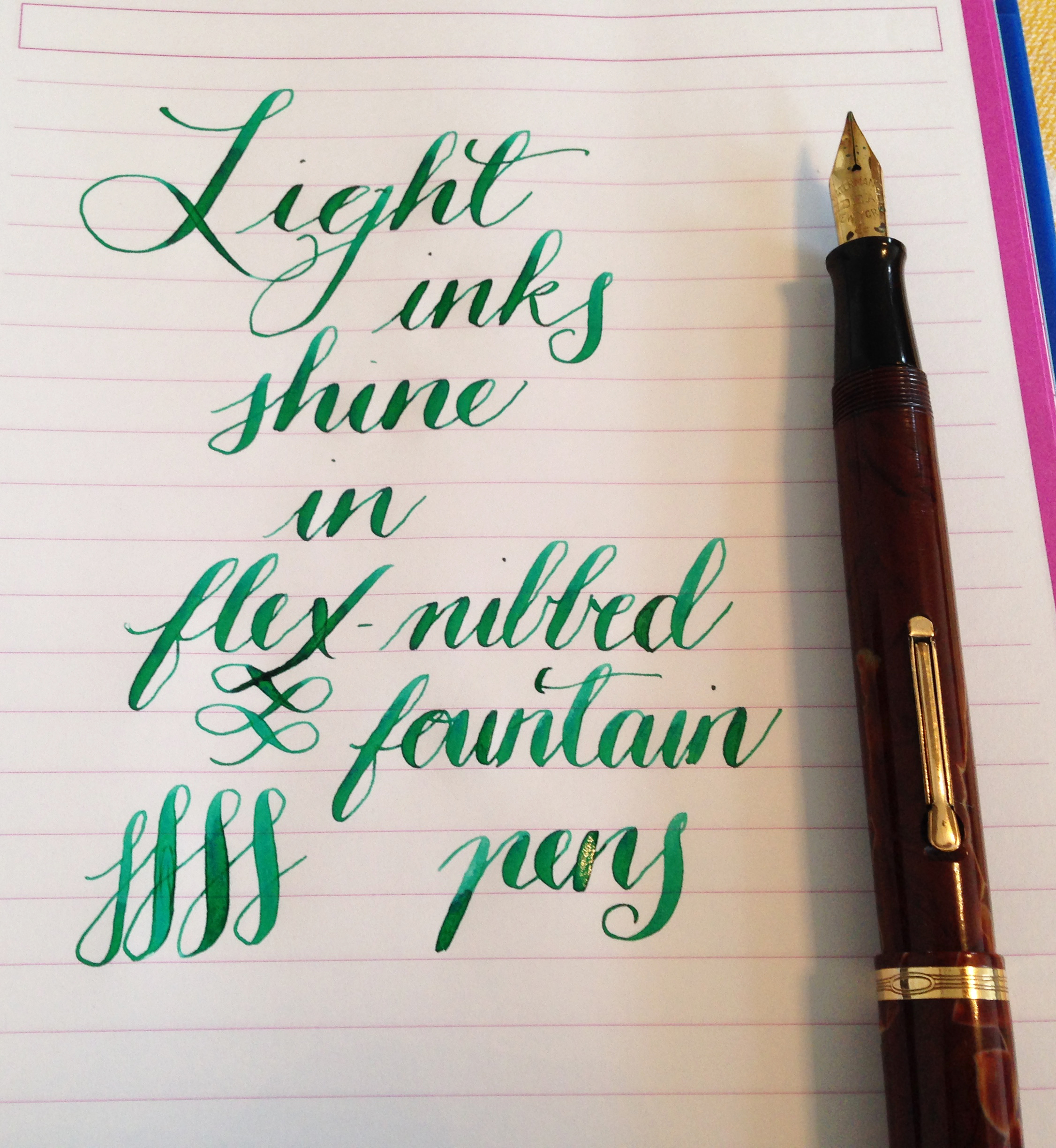
Ink shading is something a lot of people look for when they are using a flex nib. Flex nibs tend to highlight shading because of the line variation – the variation in wetness and line size changes the saturation of the ink, resulting in shading. Personally, I love it. I know some people who hate it and want a solid line.
If you are looking for an ink that will shade well with your flex nib, I find that lighter inks will show greater shading, and look beautiful as well.
2 Comments
Thank you for your article that I saw on Pinterest which led me to your article here. Personally, I love the variation that ink can have when writing with fountain pens. To me it adds so much more character. I have been collecting vintage and antique flex pens for approximately three to four years and I didn’t know that lighter colors will give you this variation. I have a ton of inks – mostly Iroshizuku and some Diamine that are medium to dark. I know that Diamine does have lighter colors available but I don’t care for the feel of their inks. I love the way Iroshizuku feels against the paper. I have recently used J. Herbin ink but they don’t feel so great and have a limited palette of colors. Do you know of any other ink companies with light colors? Thank you for your article!
I like Montblanc Irish Green/Toffee Brown/Oyster Grey, Rohrer & Klingner Alt-Goldgün, Toucan Aqua/Sienna, and quite a few Diamine inks for shading qualities. I do find J. Herbin a little unsaturated but Vert Olive and Lie de Thé are nice in a flex pen.